|
|
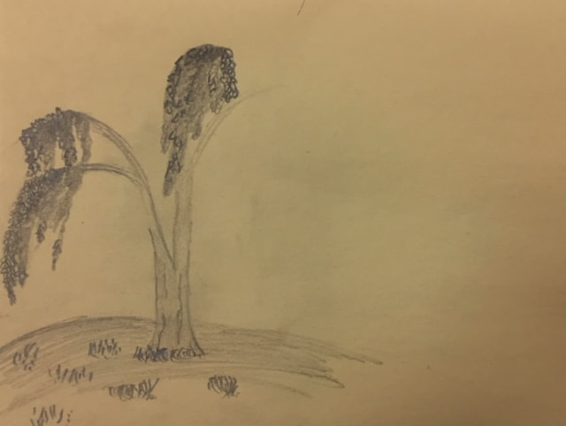
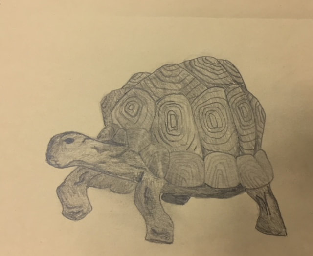
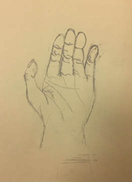
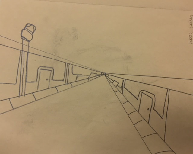
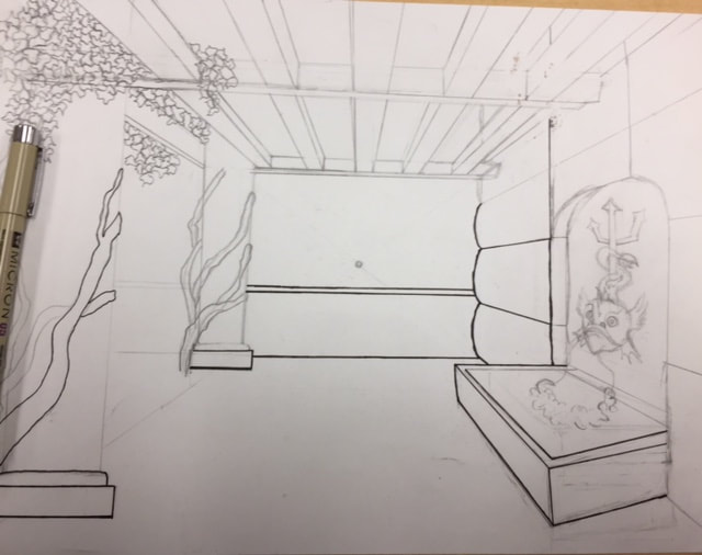
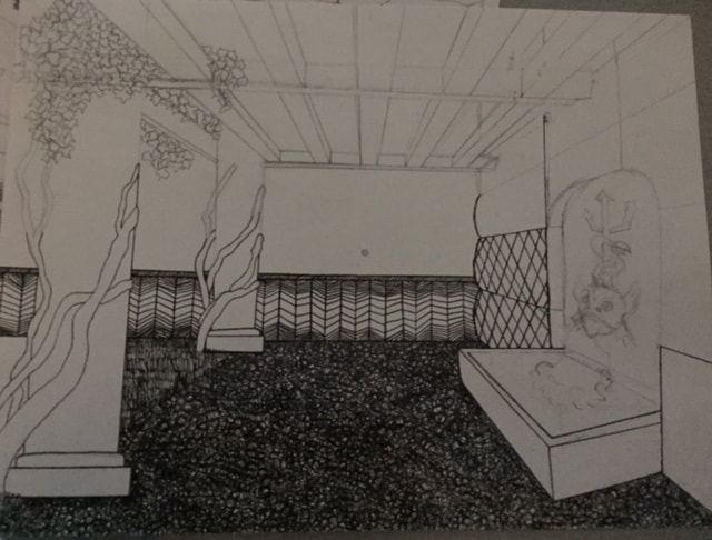
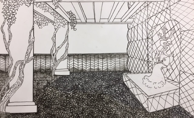
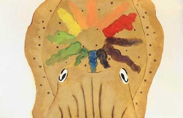
These are assement drawings we were asked to do in class. ( A tree in a landscape, one point view street, animal, hand).
Pen and Ink
|
|
|
|
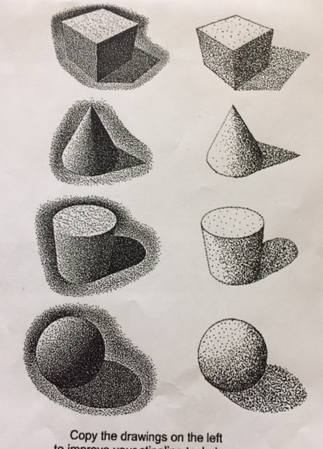
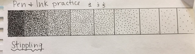
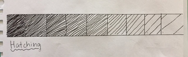
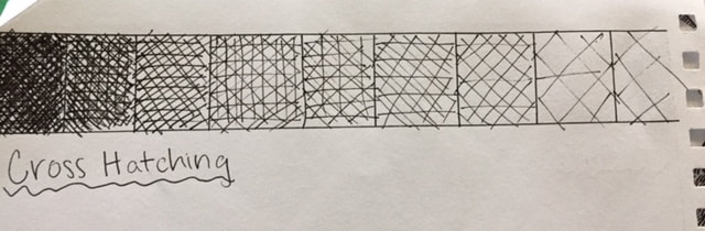
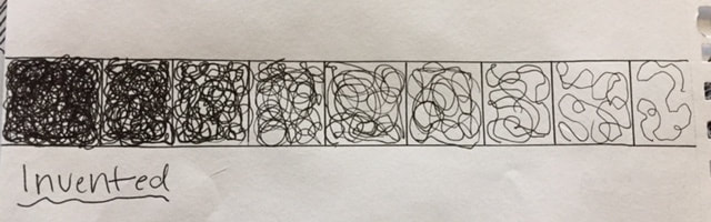
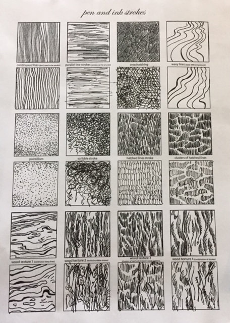
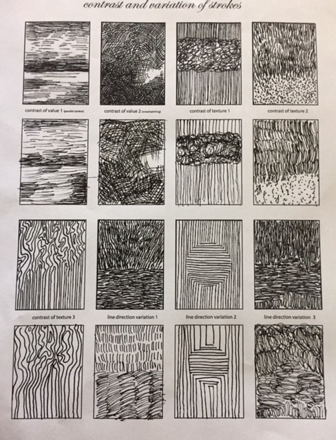
These are the practice ink worksheets and value charts we were asked to do to practice different techniques and textures using pen.
|
|
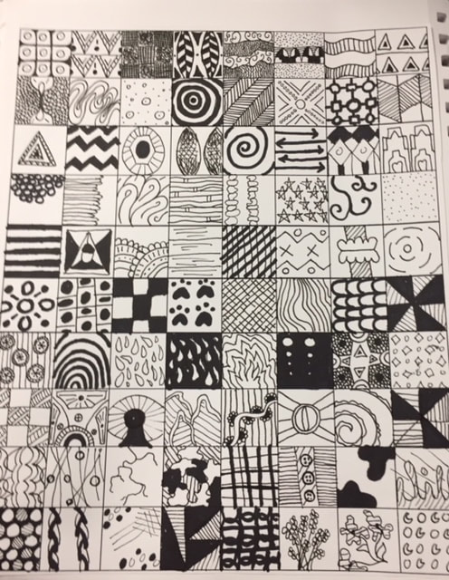
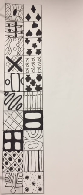
These are 100 different patterns and texture squares we did to experiment with ranges of values.
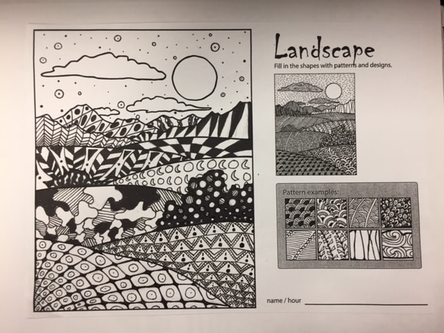
This is the landscape drawing that we completed using patterns from the 100 square exercise we did above. It was meant to help us show value within each pattern.
|
|
- Describe how you arranged your composition. Discuss your use of the elements and principles. Is it a successful composition? I think this was a good composition. I’m proud of the perspective I was able to accomplish, and I think I was able to create an effective scene. I would have liked to add a few more realistic patterns into this piece however.
- How is texture and pattern are important in your composition? The textures and patterns are extremely important in these pieces because they show value and develop objects in the piece. They allow the audience to sense things like touch and sight
- Why is value so important in this project? The values are important because they give the forms in this piece a 3 dimensional look. Without the values, the piece becomes flat and does not look realistic. Values are always important for making more realistic art pieces.
- Describe your craftsmanship (How well the project is crafted technically). I spent a lot of time working on the perspective for this project, and I think that it was executed well. I used a ruler for most of it, making sure that they led to one point. I do wish that I spent more time working on values for this project, I think it would have helped this piece.
- Explain how your knowledge and creating practice studies with value and pattern contributed to the success of your piece. Creating the different patterns and doing the practice exercises was worthwhile for this project. It allows you to figure out what patterns and textures work well for certain values and it helps especially with the layout of your piece. I think that the practice is essential to having a successful 3 dimensional piece.
- When applying the pen and ink/pattern techniques why and how is it important to make sure you understand the concepts taught in class? It is extremely important to understand the techniques for this piece, especially when it comes to showing value changes. You cannot have a successful piece without the value changes, they really make a piece look well don and professional. Another technique to know is how to warp your patterns and textures around the objects. This also gives a more realistic and 3D look to your forms.
- As a growing artist how do you think what you have learned will guide and better your future projects. Explain. I think this will definitely help me in the future, especially because I really like working with pen and ink. I think that adding more value changes in my pieces will help them be more successful.
- If you could recreate your piece what would you do differently to enhance your final outcome? I would like to add more values into my piece. I think that my piece would have been really successful if i was to add more value changes with something like stippling on my different forms, I would have also liked to warp my patterns on my forms a little better.
Water Color (Guest Artist)
Practice
|
|
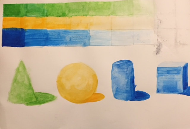
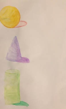
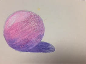
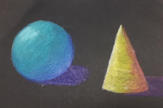
These are practice shapes and value charts we are asked to do.
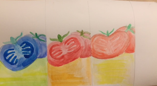
This was a case study that we were asked to do using different colors, styles, and textures.
In Progress
|
|
|
|
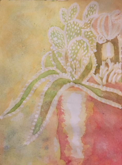
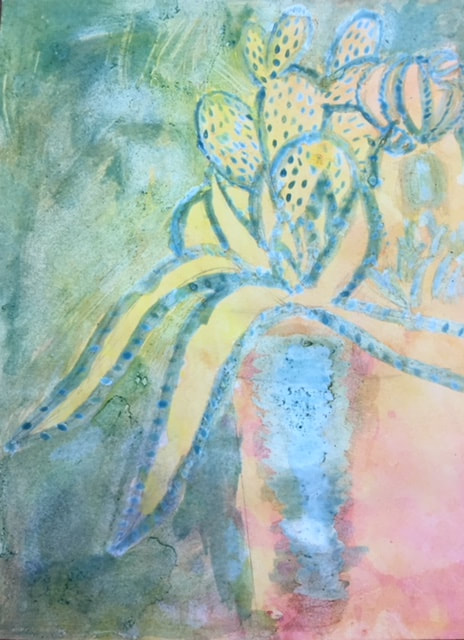
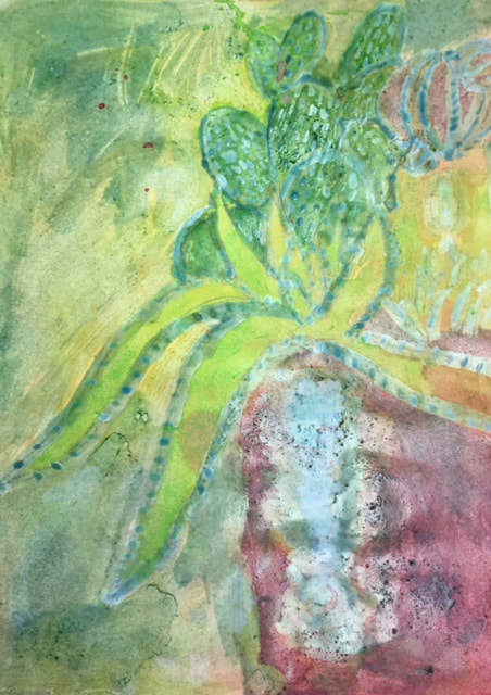
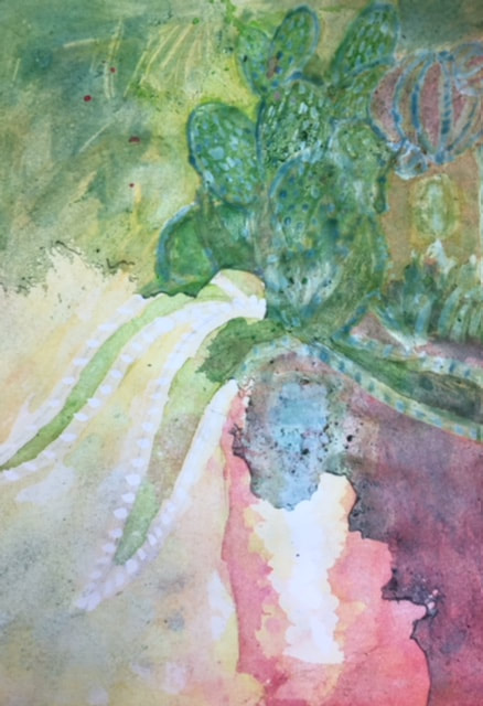
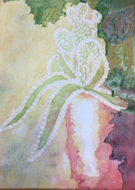
- Explain the process you had to use to create the poured watercolor painting. In order to create the final water color painting we had to spray down water onto the paper and then drip watered-down paints onto the paper. We would then pick up the paper and tilt it on it's sides until the color had completely covered the exposed areas of the paper. The class used masking fluid to cover the areas that we did not want to layer more color on during this process, which allowed it to have some value change.
- Describe any difficulties you had with this process. I had a hard time with this process because I had never done anything like it before. I am not a painter in any sense and this was something I was even more foreign to. I had a hard time showing more value change with darker pigments in the paper, and getting the color to stay in the areas I needed to be in.
- What were 4 things you learned from this project? I learned that watercolor can be used in many different ways, you can put it onto paper in unique ways that show different textures and values. I learned that you can create different textures with watercolor by using things like salt. I learned that you can make darker pigments in the paper by using less water. I learned that
- What would you do differently if you were to do this project again? If I had to do this project again I would chose a completely different composition. If I had known that we were not using brushes and that we were pouring watercolor onto the paper ahead of time I would not have gotten so cocky and decided to challenge myself. For doing something like this for the first time I needed to chose a simpler composition that would have made this piece look more successful.
- How did you use layers, textures, and color to create a successful piece? I mainly used masking fluid to assist me with creating more values and layers. I did not really add textures into this project because I did not deem them necessary at the time. By drying the paper and continuously adding more paint to the paper, I was able to have more layers in this piece.
- Do you feel that the mini watercolor lessons were beneficial to you learning more about watercolor? Explain. Personally, I did not find the mini lessons to be more educational to me since I had already learned the same techniques previously in Art 1. However, I would say that it is a nice refresher to reintroducing myself to watercolor and how it works.
- Was having a guest artist a positive experience? Explain. I would say that having a guest artist was mostly a positive experience for me. I enjoyed being in the presence of someone that was passionate about what they did and the techniques they were using. However, I do wish that I felt more prepared for his arrival.
- What did you learn from the guest artist that gave you more insight into being a professional artist? I learned that it can be somewhat easy to enjoy what you are doing as an artist. He had found something that had worked for him that sold well and that he could constantly engage in, which is not always easy to do.
Self Portrait (Primary Colors)
Practice
|
|
These are practice shapes that we did in class using different color pallets.
|
|
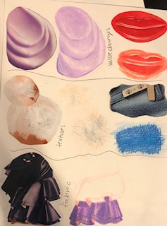
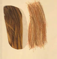
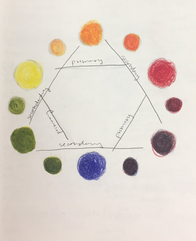
Above we were instructed to cut out different patterns and textures from magazines and remake them with prisma colored pencils. Below is a color wheel we made just using the primary colors (red, blue, and yellow).
In Progress
|
|
Reference
|
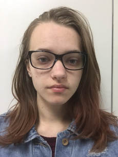
Please note that this photo was edited and cropped to be a 5x5 for the purpose of this project and is the original photo taken as a future means for reference
|
|
Final
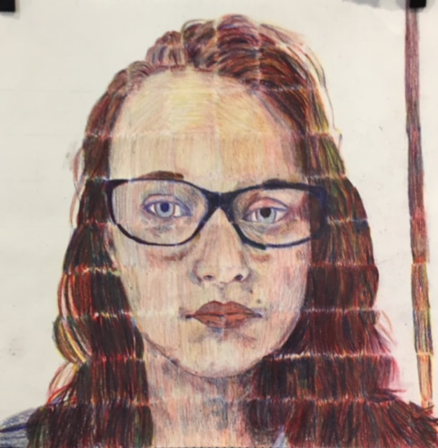
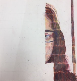
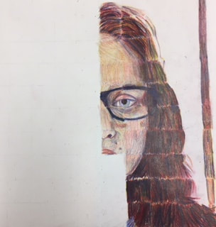
- Describe the craftsmanship of your portrait. (Is it neat and well executed?) I did not feel that piece came together neatly. The pencil strokes are inconsistent and look choppy when placed next to each other. If I could redo this project I would make sure that the pencil lines flow in the same direction, especially on the face and skin tones.
- Describe any difficulties you had blending and mixing your colors. It was difficult to create a lighter skin tone that represented a more peachy tone instead of leaning more towards a yellow of an orange.. This was even more challenging in creating a value change in the skin tone.
- Did you follow directions and draw each grid box separately? Why is this important? I did do each box separately because I had to start over for not doing each box separately the first time. This technique is mostly used to make people draw what is actually on their reference photo and it is an easy way for people to draw facial features without having to learn how to do them by hand.
- How did you create value changes with your colored pencils? I mostly created value change by using the blue and red colored pencils or by adding more layers. Adding layers made the values and colors darker, which I mostly used on the hair. For my red highlights I used the red pencil and used blue to create a value change in the hair.
- Discuss how you were able to get the color you wanted from the 3 pencils? Prisma colored pencils blend easily and have a more waxy feel compared to other colored pencils. Since they blend, we were all able to create colors from the color wheel using just the 3 primary colors. I can't necessarily say that I always got the color that I wanted but I was okay with the look of the colors on the final project.
- How could you improve your portrait? I could start over. I would want to redo the colors (especially in the skin-tone) because I want them to have a consistent base value. At the moment, you can tell that half of the face is darker while the other half is much lighter. Then I would want the pencil strokes to be consistent with each other and flow throughout the face. I would also make sure that the blending is consistent and connects the squares together.
- Looking back do you feel you were prepared for this project? What part of the unit was beneficial in the success of the portrait? I did not feel that prepared for this project when it came down to the color. The practice was a nice refresher on prisma colored pencil, however I wish I had more practice blending just the primary colors. I would have rather done just a few of the pattern/texture practices with the normal colors and then practice blending with the primary colors. I think practicing more with the primary colors would have made it easier to visualize how much layering of each color I needed to do to achieve a wider range of colors.
- Choose another classmate’s piece that you feel is an excellent example of mastering the techniques. Discuss why you feel this way. I really liked Mason's piece. I think he was able to do this project very well. The colors that he used worked really well together, and I really loved that his face was expressive. It showed some personality whereas a lot of people chose to do just a smile or a basic profile. I watched him do this project and I think this piece turned out to be very successful.
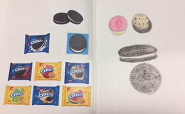
Pop Art Food Scuptures
Clay Terms
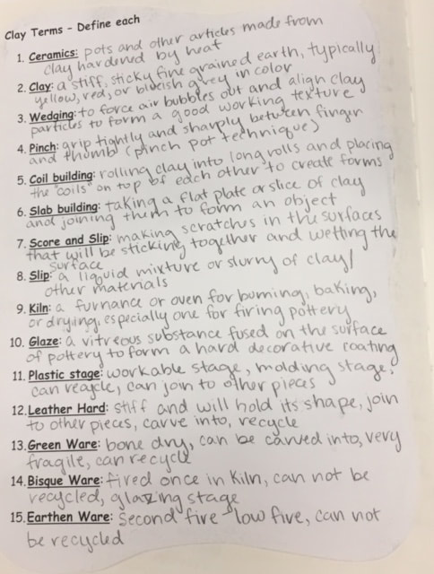
This is a worksheet we were asked to do on different clay definitions and terminology.
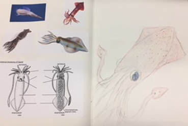
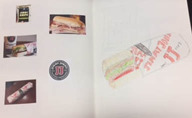
Idea Sketches and Reference Photos
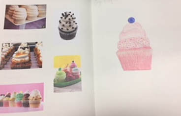
These are sketches and reference photos we were asked to have for each idea that was approved. On the left are the reference photo while on the right is the large basic sketch.
|
|
|
|
Final
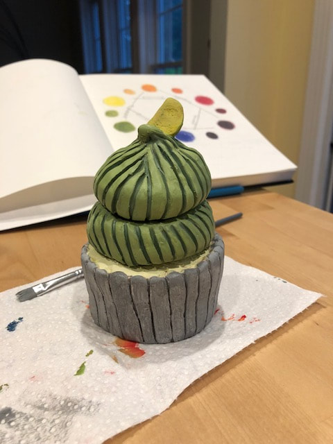
- Describe the craftsmanship of your sculpture. (Is it neat and well executed?) I do not feel that this piece is necessarily as "neat" as it could be. I wish that I had a little bit more time to smooth out the clay, especially the indented areas. I only have one previous experience with working with clay, and that was nearly 3 years ago, so I was not nearly as familiar with the techniques for working with clay.
- What was the most difficult part of this project? The most difficult part of this project was sculpting the clay. I had a very hard time slipping and scoring and getting my pieces to stick together. I think because I was not able to do this properly it resulted in one of my pieces breaking, and now I am forced to hot glue the bottom supporting pieces together, and pray that it is able to stand up on it's own. I also found that on my other piece, although it did not break, the bottom part of the cupcake did not stick to the frosting, nor did the layers of frosting stick together like I had originally intended. Although now I do have a small secret compartment to store small knickknacks in, so that's cool I guess.
- Did your color choices work together harmoniously? I think that the colors work together to create a pop art piece. Gigi's cupcakes use large a large amount of bright colored frosting. I do wish however, that I was able to create more value change when painting the piece, I would have liked the colors on the frosting to not be so abrupt.
- Is your sculpture interesting from all views? Personally, there are views that I prefer over others, but could argue that my piece is interesting from all views. I think that since the sculpture has a more cylinder shape and practically looks the same from all views, so I think that it could be considered interesting from all views.
- Describe the differences in constructing a sculpture and doing something 2D. There is a huge contrast between making something in 3D like a sculpture, and making something in 2D. Everything from designing to sketching and execution, the process can be drastically different. I would say that when it comes to art, making something in 2D is much more common, it is not as tangible as something 3D would be. Our world is 3 Dimensional, we have things that are tangible and can be viewed from all sides and perspectives. When creating and designing a sculpture, you have to take this into account, compared to creating something like a painting. When making something in 2D, you are making something that often gives an illusion of something that is 3 Dimensional, but you can only view it from one perspective. Creating a sculpture requires a more hands-on messy experience.
- How did you create textures in your sculpture? I wouldn't say that my piece really had any "texture" to it besides smooth. I used some of the clay tools to make indents in the clay for the frosting and the cupcake liner and to try and smooth out the surface the best that I could.
- Does your sculpture look like the actual food? How did you accomplish this? I'd like to think that this looks like food. I'd say that I would eat if it was edible, but then again, I would eat almost any cupcake, so that's not necessarily judged fairly.
- What would you do differently if you were to do this project again? If I were to do this project again, I would have rather had more practice creating basic shapes, slabs, and textures. I feel that if I had more experience with these things, I would have felt more prepared for what I needed to do to create my clay forms for my final.
Research Artist (Painting Project)
Frank LLoyd Wright was an American architect and interior designer known for creating beautiful modern buildings. Wright could be considered part of and a pioneer for the modernist architecture movement of the early 20th century. Modernism moves more away from ornamental and overly decorated artwork and architecture. Some characteristics of modernism include geometric shapes, large windows or glass work, flat roofs, and neutral colors (architecture.com). The modernist movement acted as almost a counter-culture reform that moved away from the lavish and extravagant ornamental times before that showed off people’s wealth. It moved away from architecture like the Biltmore house that showed off the wealth of the rich businessmen. Modernism appealed to everyone, because you did not have to be wealthy to have a minimalistic style. Things like the Great Depression, WWI, and WWII also likely helped spark this movement. It was a time when people needed to come together and work together to get the world back on their feet, and overly ornamental things were less affordable and ignorant to the times. Frank LLoyd Wright could also be considered part of the Arts and Crafts Movement which focused on organic materials and offered economic reform, and like the modernist movement, social reform.
The Frank Lloyd Wright Foundation describes his work as “A belief that structure and space could create and convey cultural values led Wright to create entirely new types of architecture.” His work was innovative for his time and he was a leader in creating a new and unique genre of his own architecture. Personally, I would describe his work as focusing on the functionalities of a home, almost in a minimalistic sense, while also incorporating an artistic modern tone into the design of his buildings.
The Frank Lloyd Wright Foundation describes his work as “A belief that structure and space could create and convey cultural values led Wright to create entirely new types of architecture.” His work was innovative for his time and he was a leader in creating a new and unique genre of his own architecture. Personally, I would describe his work as focusing on the functionalities of a home, almost in a minimalistic sense, while also incorporating an artistic modern tone into the design of his buildings.
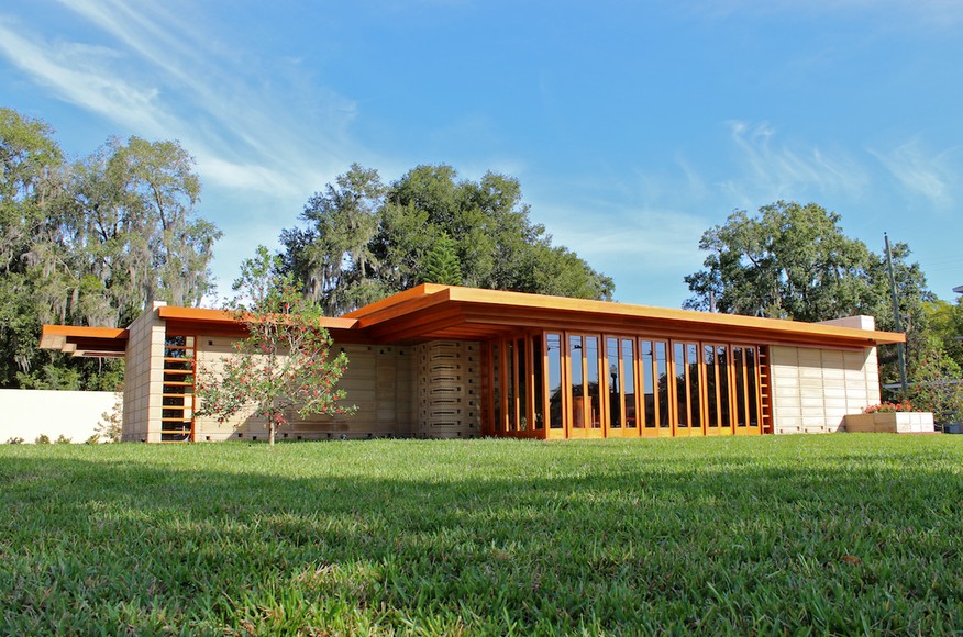
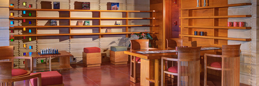
I went and saw the Usonian house in Lakeland, Florida while I was visiting my boyfriend’s family, and I got a sense of what his buildings look like and how he was involved in creating buildings for the Florida Southern College. The Usonian house was designed in 1939 by Frank LLoyd Wright, however, a recreation of the design was not built until 2013. True to the modernist and arts and crafts movement, it is mostly built using concrete and cypress wood. The idea was to have multiple houses built that would house staff and professors on the college campus.
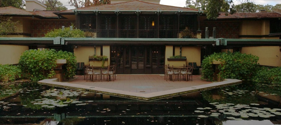
This is the Avery Coonley House in Riverside, Illinois that was designed by Frank LLoyd Wright. It was built in 1907 for a the Coonley family. It uses geometric shapes and incorporates horizontal lines and large windows. It uses something referred to as "zoned planning" that divides spaces based on function and use.
Frank had a humble beginning with a family that sometimes struggled for money, and as a young adult worked to support his family at the University of Wisconsin. Getting older and wanting to pursue an architecture career, he moved to Chicago and worked under the Adler and Sullivan firm for several years. However, Wright wanted to pursue working independently and became more interested in independent projects, which allowed his creative mind to lead him in his work.
Frank had a humble beginning with a family that sometimes struggled for money, and as a young adult worked to support his family at the University of Wisconsin. Getting older and wanting to pursue an architecture career, he moved to Chicago and worked under the Adler and Sullivan firm for several years. However, Wright wanted to pursue working independently and became more interested in independent projects, which allowed his creative mind to lead him in his work.
Sources:
http://www.theartstory.org/artist-wright-frank-lloyd.htm
https://www.architecture.com/knowledge-and-resources/knowledge-landing-page/modernism
http://franklloydwright.org/
http://www.architectmagazine.com/project-gallery/usonian-house-at-florida-southern-college
http://www.theartstory.org/artist-wright-frank-lloyd.htm
https://www.architecture.com/knowledge-and-resources/knowledge-landing-page/modernism
http://franklloydwright.org/
http://www.architectmagazine.com/project-gallery/usonian-house-at-florida-southern-college
Painting (Artist Style)
Painting Practice
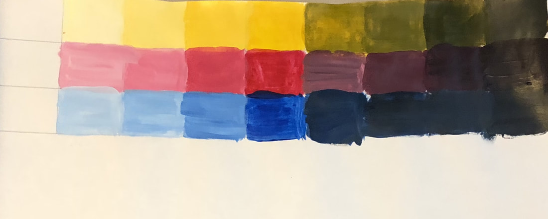
Above are value charts we were instructed to make and below is a creative color wheel.
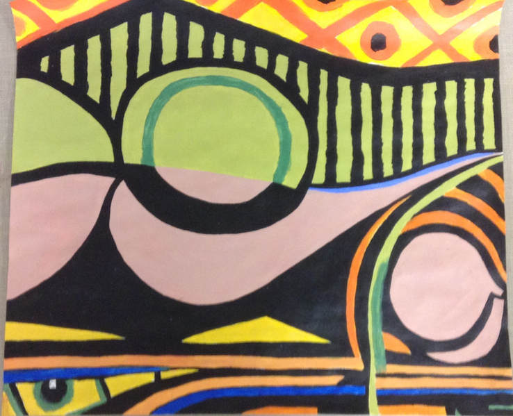
Piece of Painting
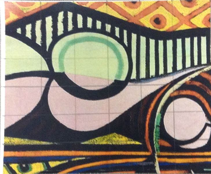
This is a cropped portion of a painting by Pablo Picasso. We were all assigned to paint a portion of a painting and once we were all finished, we put the pictures together to make a completed piece of artwork. Above is the cropped portion I was assigned and below is the painting I did.
In Progress
Above is the in progress picture I have. I had more on my phone but unfortunately I lost them when my phone broke and shut down.
Final
1. Who was your referenced artist for the painting? Name 4 main ideas you used from your research to create your painting.
Name - Frank LLoyd Wright
1. Modernism
2. The Arts and Crafts Movement
3. The Usonian House
4. simplicity, moving away from an overly ornamental style
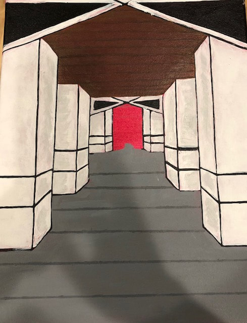
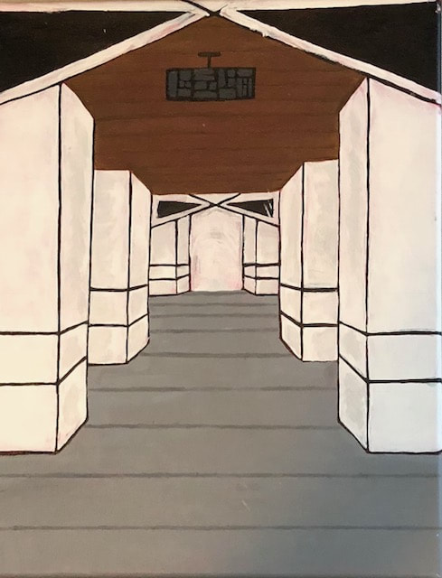
2. Describe the craftsmanship of your painting. (Is it neat and well executed?) I think that this painting could have been a lot more neat looking. I wish that I had more time to touch up the lines, especially in the columns. Modernism is characterized by smooth looking geometric shapes with sharp edges. Shapes like circles and arches aren't as common, so I had to be more creative in creating something that resembled arches.
3. What was the most difficult part of this project? The most difficult part of this project was attempting to execute straight lines under a time constraint. We did not do all of projects we were supposed to do this semester and we were running low on time for this project. As an amateur painter I don't know why I choose to do an artist that relies on me trying to paint a numerous amount of straight lines. Probably because I had more previous knowledge about him and I thought it would be easier to do the research paper, however, a bit of a poor choice for painting.
4. Describe your color choices and how they reflect the work of your chosen artist? I choose to have a neutral color palate because it was a characteristic of the modernist movement. Although Wright's work stands out in a unique way, it doesn't stand out with bright colors. Even when he does use colors, I find that they tend to be more faded, and aren't meant to take over a space or a room.
5. Describe how the style of your landscape reflects your chosen artist. I choose to create a piece that resembled a picture my sister took while we were visiting Balboa park last year in San Diego. The park is well known for it's scenery and architecture, so I thought that this would be a good place to reference for this project. I used geometric shapes that reflected the modernistic style and Frank Lloyd Wright's work.
6. What do you think your chosen artist would say if he or she could see your painting today? "It could be better." But in a really intelligent way with an excellent use of vocabulary.
7. What would you do differently if you were to do this project again? If I were to do this project again I would like to do it as a mixed media. I am not very good at painting and I think bringing elements like pen and ink into this would be useful to create a more successful and neat looking piece. I think that I would have liked to add more value change and lighting to this piece to make it look less flat.
Name - Frank LLoyd Wright
1. Modernism
2. The Arts and Crafts Movement
3. The Usonian House
4. simplicity, moving away from an overly ornamental style
2. Describe the craftsmanship of your painting. (Is it neat and well executed?) I think that this painting could have been a lot more neat looking. I wish that I had more time to touch up the lines, especially in the columns. Modernism is characterized by smooth looking geometric shapes with sharp edges. Shapes like circles and arches aren't as common, so I had to be more creative in creating something that resembled arches.
3. What was the most difficult part of this project? The most difficult part of this project was attempting to execute straight lines under a time constraint. We did not do all of projects we were supposed to do this semester and we were running low on time for this project. As an amateur painter I don't know why I choose to do an artist that relies on me trying to paint a numerous amount of straight lines. Probably because I had more previous knowledge about him and I thought it would be easier to do the research paper, however, a bit of a poor choice for painting.
4. Describe your color choices and how they reflect the work of your chosen artist? I choose to have a neutral color palate because it was a characteristic of the modernist movement. Although Wright's work stands out in a unique way, it doesn't stand out with bright colors. Even when he does use colors, I find that they tend to be more faded, and aren't meant to take over a space or a room.
5. Describe how the style of your landscape reflects your chosen artist. I choose to create a piece that resembled a picture my sister took while we were visiting Balboa park last year in San Diego. The park is well known for it's scenery and architecture, so I thought that this would be a good place to reference for this project. I used geometric shapes that reflected the modernistic style and Frank Lloyd Wright's work.
6. What do you think your chosen artist would say if he or she could see your painting today? "It could be better." But in a really intelligent way with an excellent use of vocabulary.
7. What would you do differently if you were to do this project again? If I were to do this project again I would like to do it as a mixed media. I am not very good at painting and I think bringing elements like pen and ink into this would be useful to create a more successful and neat looking piece. I think that I would have liked to add more value change and lighting to this piece to make it look less flat.
Reflection
This semester was a long one, which somehow made for less art projects. As much as I felt like I was constantly running out of time I also felt like we did a lot less than we did in drawing last semester. However, this semester was still a good one. I remembered how much I don’t like clay, and I remembered how much pain-staking detail pen and ink takes. Probably my favorite thing we did this semester was the watercolor project. I was already not very familiar with watercolor, and the guest artist we had might as well have thrown me out of the window, but it was still my favorite. When he was over demonstrating the whole time I was thinking, “wow this is crazy”, and it was crazy. But then he showed us some of his work and how doing all of those crazy things can benefit to make a successful piece. I’m not at a point where I can say that I love watercolor, but I definitely have more of an appreciation for it. Our guest artist (sorry I can’t remember his name) was passionate about what he was doing, and he found something that worked for him. Yes, to everyone else it’s a little weird, but he created a system for himself that works and allows him to make a living as an artist. I aspire to be like him, as someone that is passionate about what they are doing, and someone that has found their own unique style. And that’s something I hope to find in college while studying graphic design. Thank you for another great semester Rossi. One of the most important things you have taught me this semester, is that it’s possible to pursue your dream as an artist. And I couldn’t ask for anything better right before I go off to college.
