|
Although I did not always enjoy my compositions, I am grateful for the things that I learned in this class. I think drawing is one of my stronger mediums, and this class really set that in stone for me. I really appreciated the fabric unit because it really taught me how to look at highlights and really pay attention to how important values are in a drawing. I also really liked that I got to work with prisma colors more and learn how to blend them more easily, it will be very valuable to me in the future. As much as I did not like the self portrait unit, I was very happy that I was finally learning how to draw facial features properly. I draw a lot of things digitally with cartoon characters and learning how to properly draw and measure out the facial features will really improve those drawings.
Even though I did not always enjoy this class, I can definitely say without a doubt that it was worth it. Learning basic drawing skills is extremely important to know, especially since I want to pursue a career as a graphic designer. This class will continue to be valuable to me in the future, and I really think anyone that wants to become a better artist should take this class with Rossi.
0 Comments
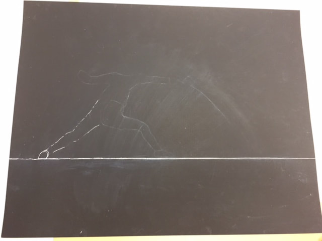
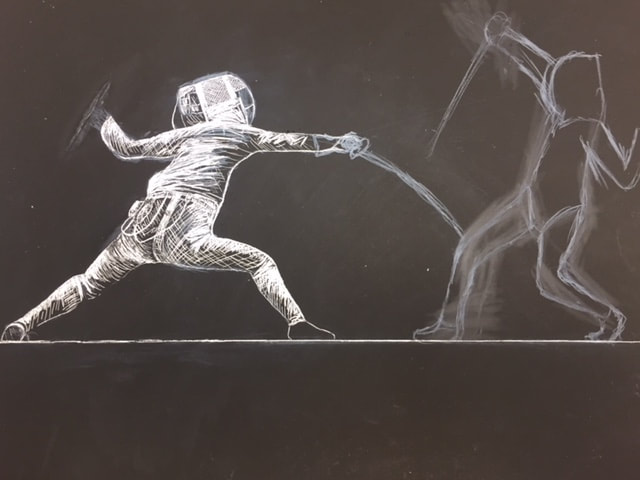
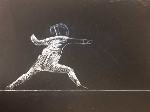
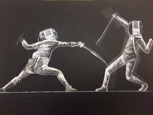
1. Describe the subject matter and meaning of your artwork. I decided to do a fencing match between two people. I really enjoyed this project because my boyfriend Ian is a fencer himself. His passion about this sport really makes me have a greater appreciation for it. The fencer on the left is scoring a point (or touch) in the match.
2. How did you use textures to enhance your picture? I used textures to enhance this picture by layering and using different cross hatch techniques. My favorite medium is pen and ink, and as soon as I started to think about this project like drawing with a white pen, it became easier for me to visualize. I used a lot of hatching in this project, and heavy cross hatching in really bright areas, this gives it more realism and makes it look less flat. 3. How did you balance your artwork and create a well-organized composition? I balanced my artwork with placement and focusing on the match itself. I think that by just drawing the fencers it really focuses in on the sport itself. There is no background to distract you from the movement. I think it has the potential to be a more powerful image this way. 4. How did you imply movement in your drawing? I was able to imply movement in my drawing by showing a brief moment in a fencing match. Fencers move extremely quickly, and so my drawing implied movement by showing a brief instance that would likely only last for 2 seconds in real time. Fencing takes extreme skill and good coordination, and I think that the left fencer especially captures that. 5. How could you improve your artwork? I think I could improve my artwork by adjusting the placement of the fencers. I would like it to be more centered instead of offset. If I was able to plan ahead of time better where the placement would be between the two fencers, I think it really made this piece stand out well and made it more successful. 6. How did you demonstrate a wide range of shading values? I demonstrated a wide range of shading values by using pen and ink techniques like hatching and cross hatching. In art 1, I did a yin yang symbol using pen and ink. I was able to create contrast between the dark and white by placing things closer or farther apart from each other, with more or less detail. I was able to accomplish a similar thing here, with doing more cross hatching in highlighted areas and lines spread farther apart in darker areas.
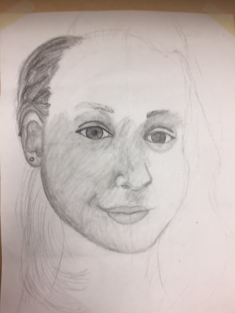
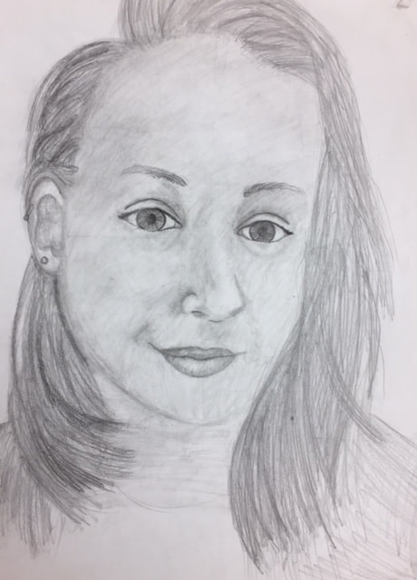
1. Explain the process you went through to develop your drawing. We went through the process in class of drawing individual features of the face in class (practice drawings below) which helped us focus on details and shapes we would be using to draw our own faces. By studying the dimensions and proportions of the face and facial features, it was easier or our class to draw a self portrait. The skull drawing especially helped with the shape of the face and I appreciated it because it helped prepare me for drawing my face at a bit of an angle.
2. Explain how you found the different values in the portrait? I found different values by taking a picture of myself and converting it to gray scale. It helped me find where the highlights and shadows would be. This helped me visualize and capture the different values I would need to use. 3. Did you achieve a full range of the different values within your portrait? How? I do think I was able to achieve a wide range of values, just not as many as I could have. i think if I had added some more darker values to the piece it would have really helped it stand out. 4. Describe your craftsmanship. Is the artwork executed and crafted neatly? I think I was able to capture the proportions and my face well. I'm happy that I was able to capture drawing my face at a bit of an angle while I was smiling. My first self portrait I wasn't able to capture emotion, and I was happy that I was able to do that here. 5. How were you able to capture your look? I think I was able to capture the proportions and my face well. I'm happy that I was able to capture drawing my face at a bit of an angle while I was smiling. My first self portrait I wasn't able to capture emotion, and I was happy that I was able to do that here. I think that the practice was essential and contributed to the final. 6. Explain how you made sure you had correct facial feature placement. I made sure that I had correct facial feature placement by using a ruler and the measurements that we practiced. By using the width of the eye, I was able to measure out the width and length of all of the facial features. 7. Explain the importance of learning how to draw all the features individually. It is extremely important to learn how to draw the features individually because everyone has different features. You need to understand basic measurements so that you can make adjustments and modify them to make them the unique features that belong to a specific person. Without understanding how to do that, it's extremely difficult to make a realistic drawing. 8. What part of this unit was the most beneficial and why? Learning how to draw the features individually was the most beneficial thing in this unit. There are a lot of skills and details that go into making the facial features look successful, and learning those will be the most useful to me in the future. 9. List any obstacles you had to overcome and how you dealt with them. I have a hard time with self esteem. I really did not enjoy having to look at my face in detail and recreate it. I was able to overcome some of those issues with the emotion I choose to show in the reference photo. The first self portrait I did, I had an expressionless face and looked really depressed, I felt much better about this project because I could show emotion, which I wasn't able to do before. Eyes
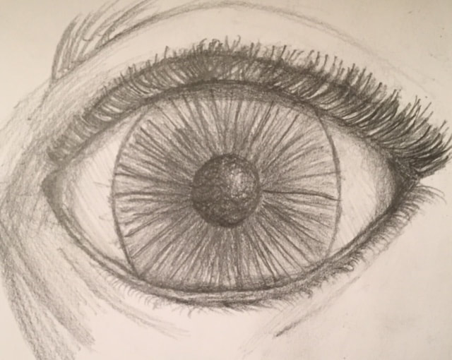
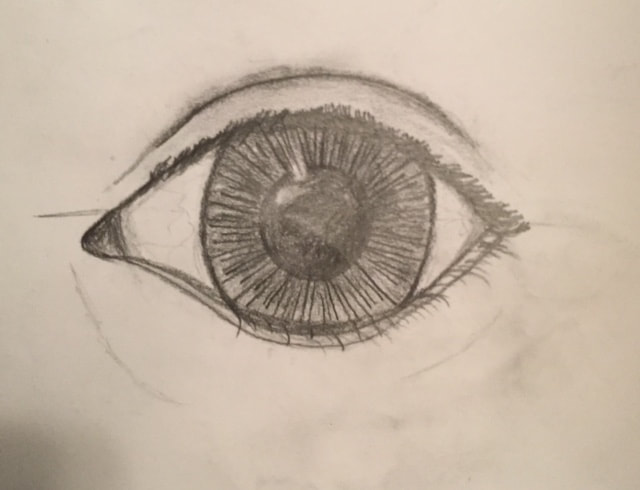
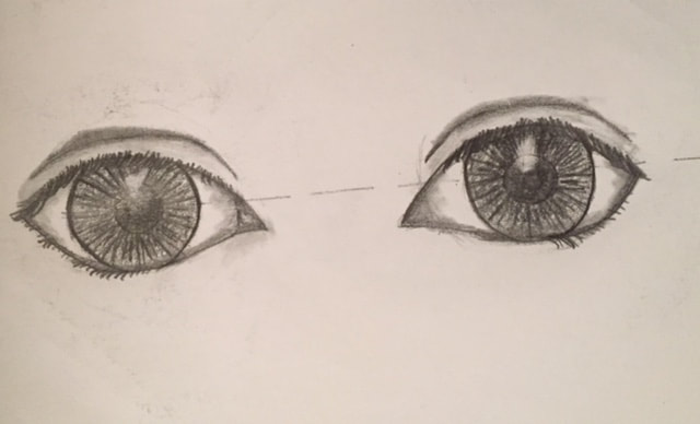 These are practice eyes that we all did. The pair of eyes as well as the picture on the right are drawings of my own eyes, while the one on the left is the first practice one we did together. Noses
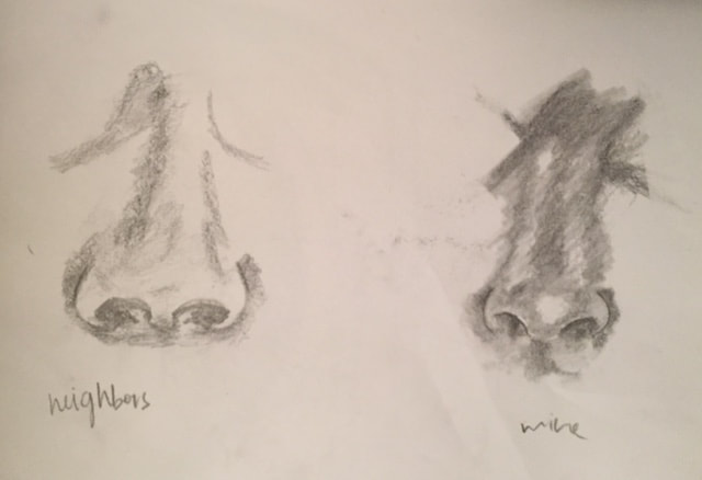
These are practice noses that we were instructed to do. In the first picture on the left was the first nose that we did together where I (attempted) to draw my neighbor, Skylar's nose, the one on the right is my own. The second picture is my own nose drawn from different angles (profile and straight on). Lips
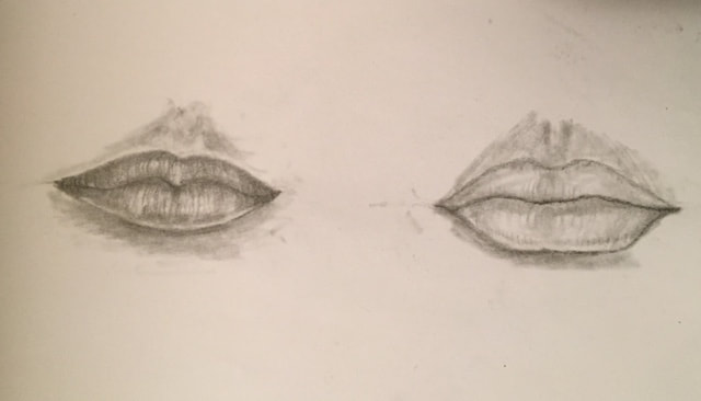
These are practice lips that we did as a class. The one on the very left we did along with a video tutorial about basic lip drawing. The one on the far right is a lip drawing we did with another video tutorial about drawing lips in a 3/4 view.
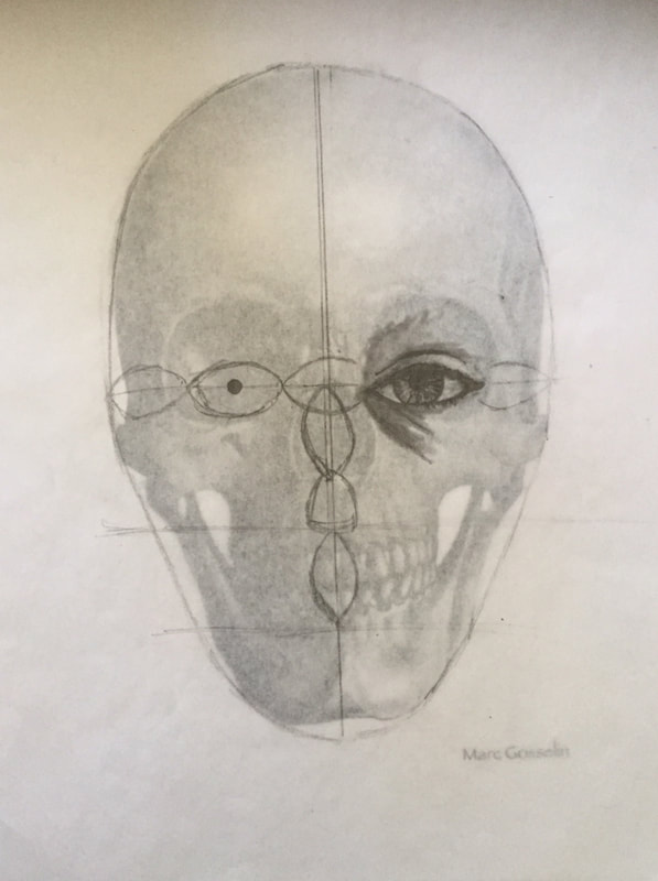 This is a practice drawing we did with graphite pencil. We were all given a basic skull printout and tracing paper. We started to draw ourselves on top of the tracing paper that we were given so that we could see where features lined up with the skull. I used the measurement and proportion skills that the class had learned in the previous practice days to accomplish this.
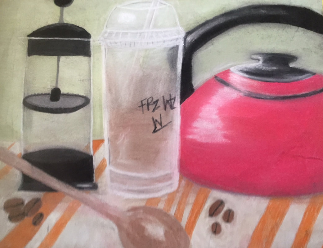
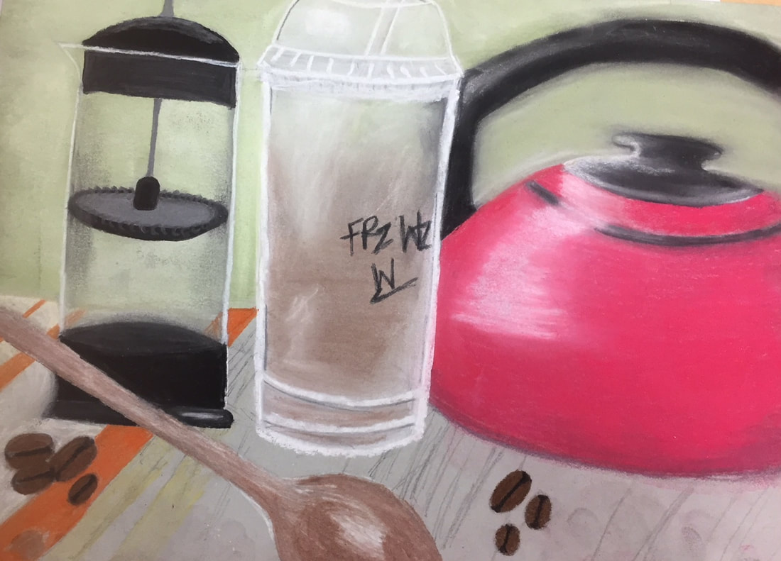
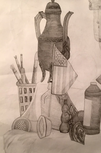
On the left is my final for the opacity project. The title of the piece is called "Coffee." I used reference photos from the internet as well as pictures that I took to help create this piece. On the right is an in progress picture I took. (I forgot to take more).
Candy Drawing (Pastel)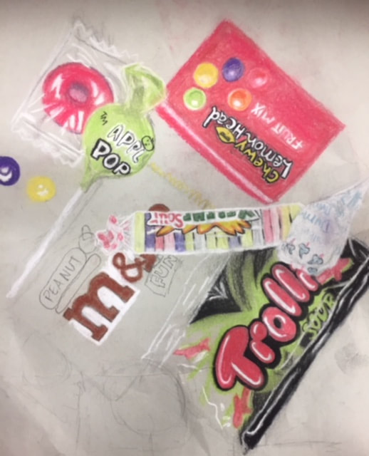 This is a practice drawing of candy that we did using pastels. We took a picture of a pile of candy for reference.
 1. Describe the craftsmanship of your drawing. (Is it clear, clean edges, blended well, smudges, defined space, etc.)
I believe that there are a lot of smudges on my drawing, I wish that I was able to have more crisp lines where I needed them. However, I was happy with the way that the glass forms turned out. I believe I was able to capture the transparency. 2. Are your values and shadows realistic? How many values did you include? How and why are values important? I think that my shadows are realistic and I have a nice outline for them. I do wish that I had added more value to the drawing, I think it would have helped the piece be more successful. I probably has about 5 or 6 different values. Values are important because they show realism in the piece and give the objects dimensions. Without a wide range or value, the piece becomes flat. 3. Is there a clear source of lighting? There is a source of lighting coming in from the top left but I do think it could be more clear with more contrast and values. 4. How important were the compositional sketches? Explain. The compositional sketches are important because they give you a visual idea of what you are drawing in your final piece. It shows you what details you may need to focus on, or how many values to add.
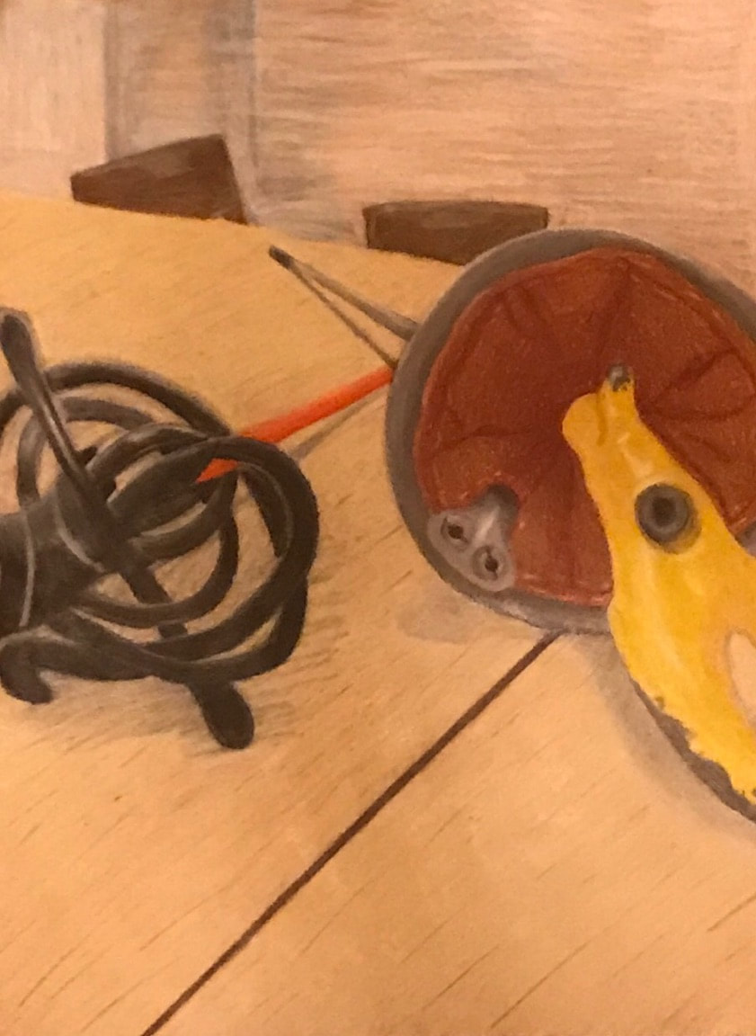
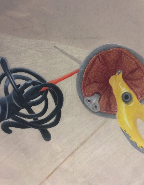
This drawing is two swords from a forshortened perspective. The one on the left is a foilist fencing sword while the one on the right is a Spanish Rapier that I bought my boyfriend for our 2 year anniversary. 1. Describe how you created an interesting point of view? Was it successful? Why or why not? I created an interesting point of view by looking down at the sword from the handle. I think that it was successful because it forces you to look at the handle instead of the blade. The handle is much more blown up proportionally from the rest of the sword, which I think helped bring this piece together. If I could change anything about the perspective, I might have moved the placement of the actual blade of the foil sword (left), I believe it is slightly off. 2. Why is it important to understand perspective and how to draw it? It is incredibly important to understand perspective and how to draw it because it allows others to really observe and look at your drawing. Without perspective, the drawing is incredibly flat, and there is no realism portrayed within the drawing. When drawing something that you are observing from real life, perspective is necessary. Everything we draw from life has a perspective, so it is important to understand the different types and how to draw them. 3. How were the colored pencil exercises important in the success of your piece? The color pencil exercises were important because it gave me a fresh reminder of blending techniques for prisma color pencils. It had been a while since I had worked with these color pencils, and doing these exercises really helped me figure out how to work in highlights and shadows into a color pencil piece. If I had started this project without the practice, my piece might have turned out much differently. 4. Describe the craftsmanship of your colored pencil. What techniques were used? (How well the project is technically crafted). I think I did fairly well with the craftsmanship of this project. I continued over and over with layer after layer to really make this piece complete. I tried blending with softer and lighter colors to help bring out the highlights and contrasts a little more, and to soften the shadows. I do wish that I was able to add a few more layers to some areas of the drawing, but overall I think I covered the toned paper well. 5.Were you able to achieve depth by showing a foreground, middle ground and back- ground? Explain. I was able to achieve depth by drawing the blades to a certain perspective point. I used a table as part of the background so that I could show shadows on the swords in order to give them more depth. I put two chairs at the end of the table and a lighter background that was smaller compared to the table. By doing this, I was able to catch more forshortening and depth in the drawing. 6.Explain your experience with colored pencil and the project in general. What were the obstacles and advantages? I had very brief experience with prisma colored pencils prior to this project and I was excited to be able to use them. I do enjoy blending the colors together to create a matted look. It did take awhile to achieve this look however, as I had to slowly and carefully add layer after layer of the pencil onto the paper. I do believe that the toned paper helped contribute to this piece as well by helping bring the color forward more. Some advantages to using color pencil was I was able to help show contrast between the warm and cool colors, which I really enjoyed. However, using color pencil is a slow and long process. 7. Looking back on the progression of this project what skills, techniques or other information would you like to have been taught? Do you feel you were prepared for this project? I would have been liked to be taught more about blending and how to successfully use shadows in a prisma piece. The shadows were the most challenging to me and I would have liked more practice and experimentation with colors for that. I did feel prepared for this project however, the practice prisma pieces helped me have a visual of what I would need to do for the final piece in order for it to be successful. The following practice pieces were done in prisma color pencil.
Glass Drawing (Practice)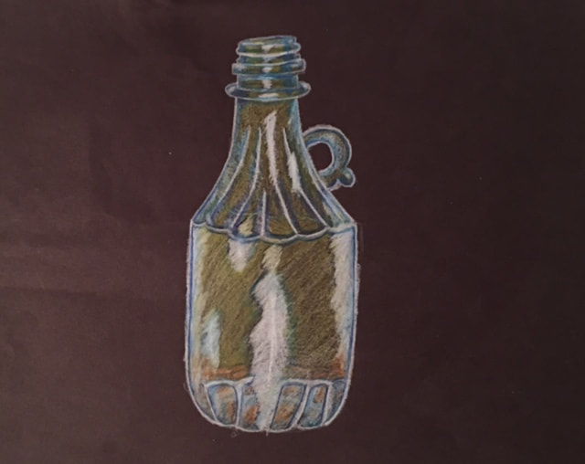
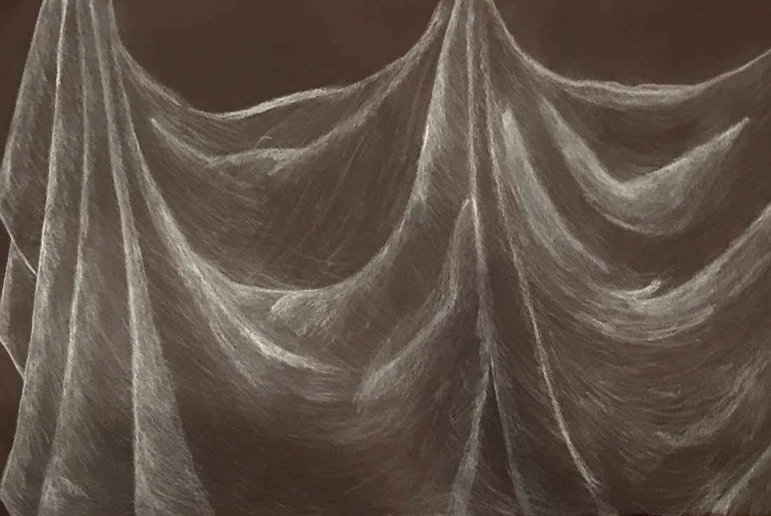 1. Did you use a wide range of values? (A range from white to black with at least 9 values). Explain how is this evident?
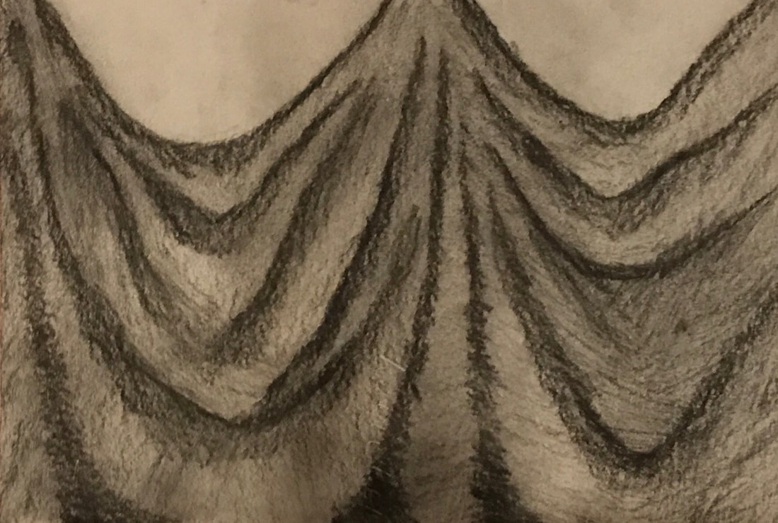
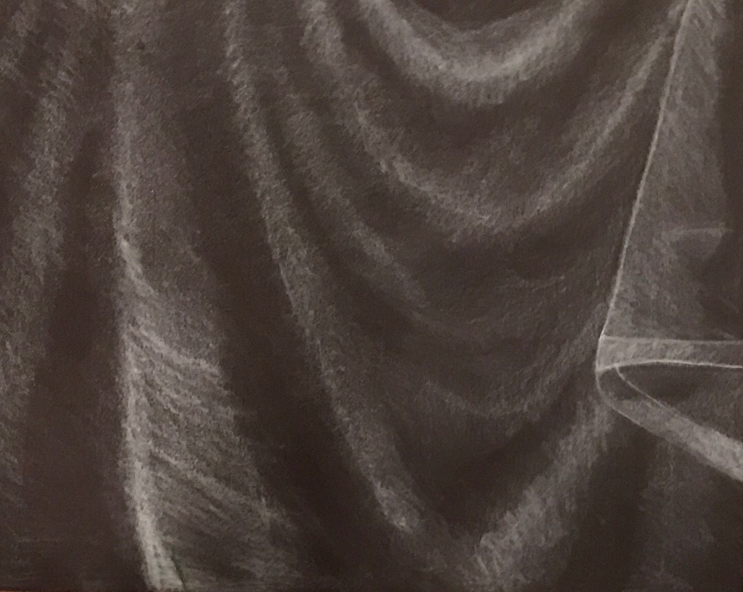
Yes, I used a wide range of values. In the white charcoal drawings I used my whitest whites as the brightest highlight and slowly faded out to black to show the fading out of the highlights to the shadows. 2. Explain how your knowledge and creating practice studies with value contributed to your piece. Doing practice studies for this piece really helped contribute to the final because it gave me time to learn techniques (and practice them) for drawing fabric. I really like using the "pillars and cones" technique for completing these pieces. It helped me visualize where my highlights and shadows would be. 3. Describe the blending and transitions in your fabric (discuss your use of pressure with pencil/colored pencil/charcoal pencil and other techniques to achieve this). The use of pressure with the charcoal is important because it brings out the highlights and shadows in the folded fabric. The lightest lights show the most highlighted areas and we're achieved using the most pressure. By blending the charcoal it gives a faded look (and more realistic) between the highlights and shadows. 4. Explain how your interpretation of texture is essential in capturing the look of the object. Interpretation of texture is essential in capturing the look of the object because it clearly shows where the folds in the fabric are. This gives a much more realistic look to the fabric, which is what we have been trying to achieve throughout the class. 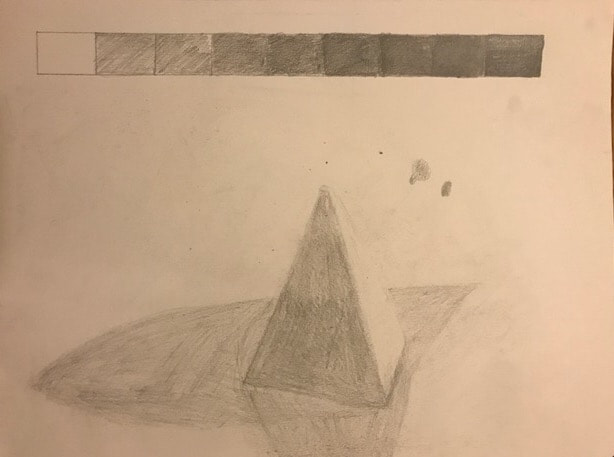 This is a practice drawing we did to test our abilities with values. On the top is a value chart from light to dark. 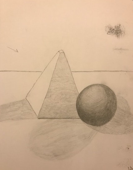 This is the final form drawing I did after the practice. We drew forms that were on the table and it includes more values and shadows. 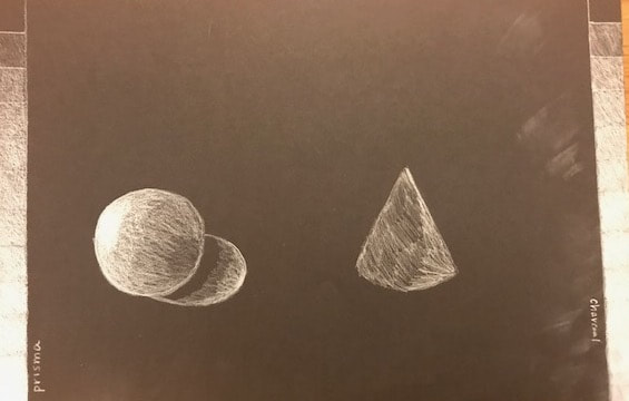 This is a practice drawing we did using white prisma color pencil and white charcoal. On the left is a sphere with a value chart in white prisma color pencil and on the right is a cone and a value chart made with white charcoal. 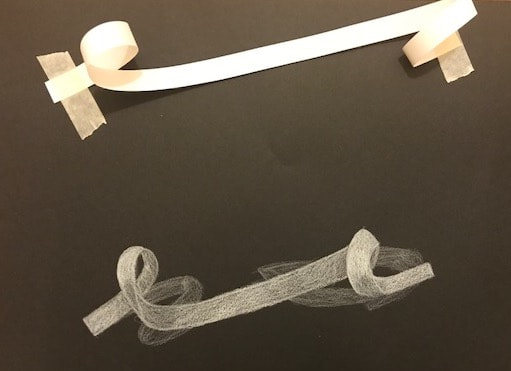 We were instructed to loop a ribbon twice around and tape it to a black piece of paper. We then had the choice to draw it using white charcoal or a white prisma. I personally used a white charcoal pencil.
|